FORGED IN STRENGTH, BUILT ON DISCIPLINE
We created two distinct yet connected brand identities for Titan — a group uniting Titan Academy and Titan Industry, both rooted in protection, leadership, and precision. The goal was to establish a unified visual language that reflects their shared values while allowing each division to express its own purpose and focus.

Your brand shouldn’t just stand strong — it should lead, empower, and inspire confidence across every field.

Titan Academy empowers professionals through knowledge — shaping discipline, confidence, and leadership for those who protect and serve.
CHALLENGE
CRAFTING A DUAL IDENTITY WITH ONE CORE SPIRIT
Titan’s challenge was to visually align two brands — one focused on training professionals (Academy), and the other on industrial excellence and protection services (Industry). Both needed to convey power, integrity, and modernity without losing their individual missions. The task was to find balance between strength and clarity, discipline and approachability.
SOLUTION
ONE SYMBOL, TWO STORIES
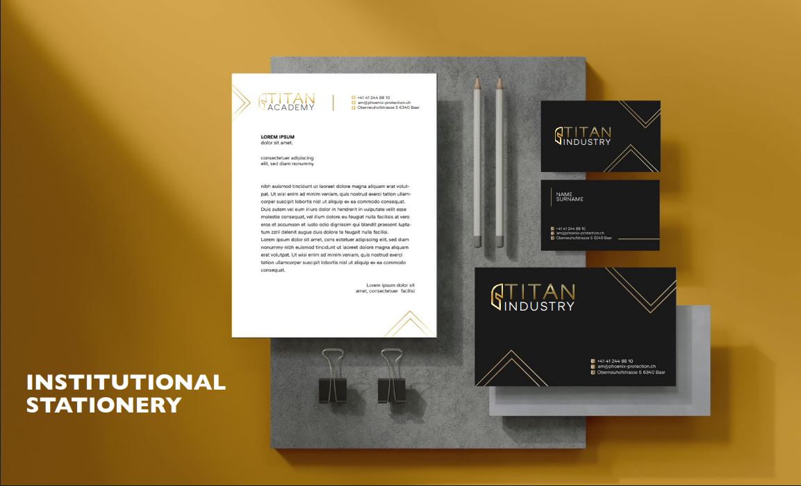
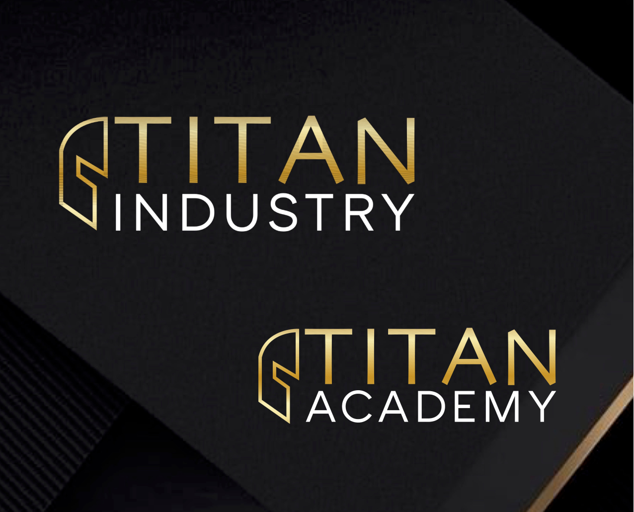
We designed a minimalist logo inspired by a helmet — the timeless emblem of protection, focus, and resilience. Clean geometry, uniform line weight, and harmonious proportions create a design that embodies strength and precision. The golden tones symbolize achievement and excellence, while the monochrome palette expresses professionalism and trust.
The brand books for both divisions define a complete system: color hierarchy, typography, composition rules, and visual tone — ensuring consistency across digital and print communication while giving each brand its own voice.
BEYOND THE WEBSITE
A VISUAL LANGUAGE OF LEADERSHIP
The new identities elevate Titan into a unified ecosystem — where Titan Academy represents growth and mastery, and Titan Industry stands for execution and excellence. Together, they form a visual system that feels powerful, modern, and credible — designed to inspire confidence and reflect the integrity behind the name Titan.
TO CLOSE THE PROJECT, WE DELIVERED TITAN ACADEMY’S NEW LOGO AND BRAND GUIDELINES — BRINGING STRENGTH, FOCUS, AND UNITY INTO A CLEAR, RECOGNIZABLE VISUAL LANGUAGE.
RESULTS
STRENGTH + UNITY
Through clear structure, timeless design, and attention to detail, Titan now communicates its values with confidence and cohesion. The visual harmony between both brands strengthens recognition, ensures clarity across channels, and reinforces Titan’s position as a trusted name in professional development and industrial protection.
"Our new identity unites strength, precision, and purpose — perfectly capturing who Titan is and what it stands for." Titan Team
+100%
Improved visual recognition across digital and print
3×
More consistent branding across materials and presentations
+45%
Higher engagement through cohesive and professional design
Next case
WHERE TASTE AND DESIGN CREATE A SENSE OF HOME
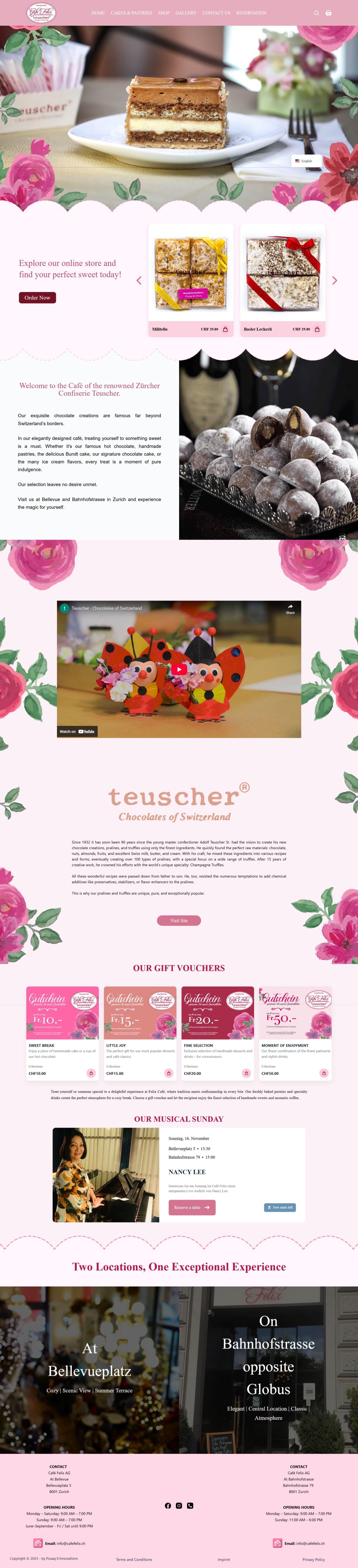
We crafted a digital identity for Café Felix that reflects its Swiss heritage and artisanal passion. The new website blends warm aesthetics with refined simplicity — translating the café’s cozy atmosphere, exquisite pastries, and local charm into a modern, immersive online experience.
Your brand shouldn’t just serve — it should tell a story, evoke emotions, and invite people to stay a little longer.
CAFÉ FELIX CELEBRATES THE ART OF TASTE — BLENDING TRADITIONAL SWISS CRAFTSMANSHIP WITH MODERN ELEGANCE AND A TOUCH OF SWEET INDULGENCE.
CHALLENGE
BRINGING A LOCAL GEM INTO THE DIGITAL WORLD
Café Felix is a beloved spot known for its handmade pastries, artisanal chocolates, and timeless charm. Yet, its digital presence didn’t reflect the warmth and sophistication experienced inside the café. The challenge was to translate this sensory, in-person atmosphere into a refined online experience — one that feels inviting, elegant, and unmistakably Felix.
SOLUTION
FROM LOCAL CHARM TO DIGITAL ELEGANCE
Together with Café Felix, we designed an online experience that captures the café’s authentic spirit — blending craftsmanship, hospitality, and design. The new platform highlights Felix’s artisanal pastries and chocolates through refined visuals, intuitive navigation, and a soft, inviting tone. Every element — from color palette to typography — evokes warmth, care, and Swiss precision, allowing visitors to feel the essence of Café Felix before they even step inside.
WE LAUNCHED CAFÉ FELIX’S NEW WEBSITE AND SAW A STRONG RESPONSE: VISITORS SPENT MORE TIME EXPLORING THE MENU, ONLINE ORDERS GREW, AND THE BRAND STRENGTHENED ITS DIGITAL PRESENCE WHILE PRESERVING ITS TIMELESS IDENTITY.
BEYOND THE WEBSITE
A TIMELESS BRAND EXPERIENCE CRAFTED WITH HEART
For Café Felix, we went far beyond a simple digital presence — shaping a complete brand story that captures the café’s soul. From the scent of freshly baked pastries to the elegant presentation of each dessert, every detail inspired a design language rooted in warmth, tradition, and sophistication. We developed a cohesive visual system that blends classic Swiss refinement with modern aesthetics — a calm color palette, graceful typography, and delicate illustrations reflecting craftsmanship and care. This identity extends across packaging, menus, photography, and digital communication, creating one seamless experience both online and in-store. The result is a brand that feels genuine and memorable — inviting guests to pause, savor the moment, and experience the artistry of Café Felix in every detail.
TO CLOSE THE PROJECT, WE LAUNCHED CAFÉ FELIX’S NEW WEBSITE ALONG WITH A REFINED VISUAL LANGUAGE — BRINGING WARMTH, ELEGANCE, AND CRAFTSMANSHIP TOGETHER IN ONE COHESIVE DIGITAL EXPERIENCE.
RESULTS
ELEGANCE + EMOTION
With the new identity, Café Felix strengthened its presence as one of Zurich’s most cherished cafés — uniting craftsmanship, tradition, and contemporary design in one refined digital experience. The website now mirrors the atmosphere guests feel inside: calm, elegant, and inviting. Engagement increased as more visitors explored the menu, placed online orders, and connected emotionally with the brand story.
"The new design captures our essence perfectly — it feels like walking into Café Felix, even from a screen." Café Felix Team
+40%
Increase in online orders and reservations
2.1×
Longer browsing time per visitor
+25%
Higher engagement through intuitive and visual storytelling
Next case
where energy and innovation power a sustainable future
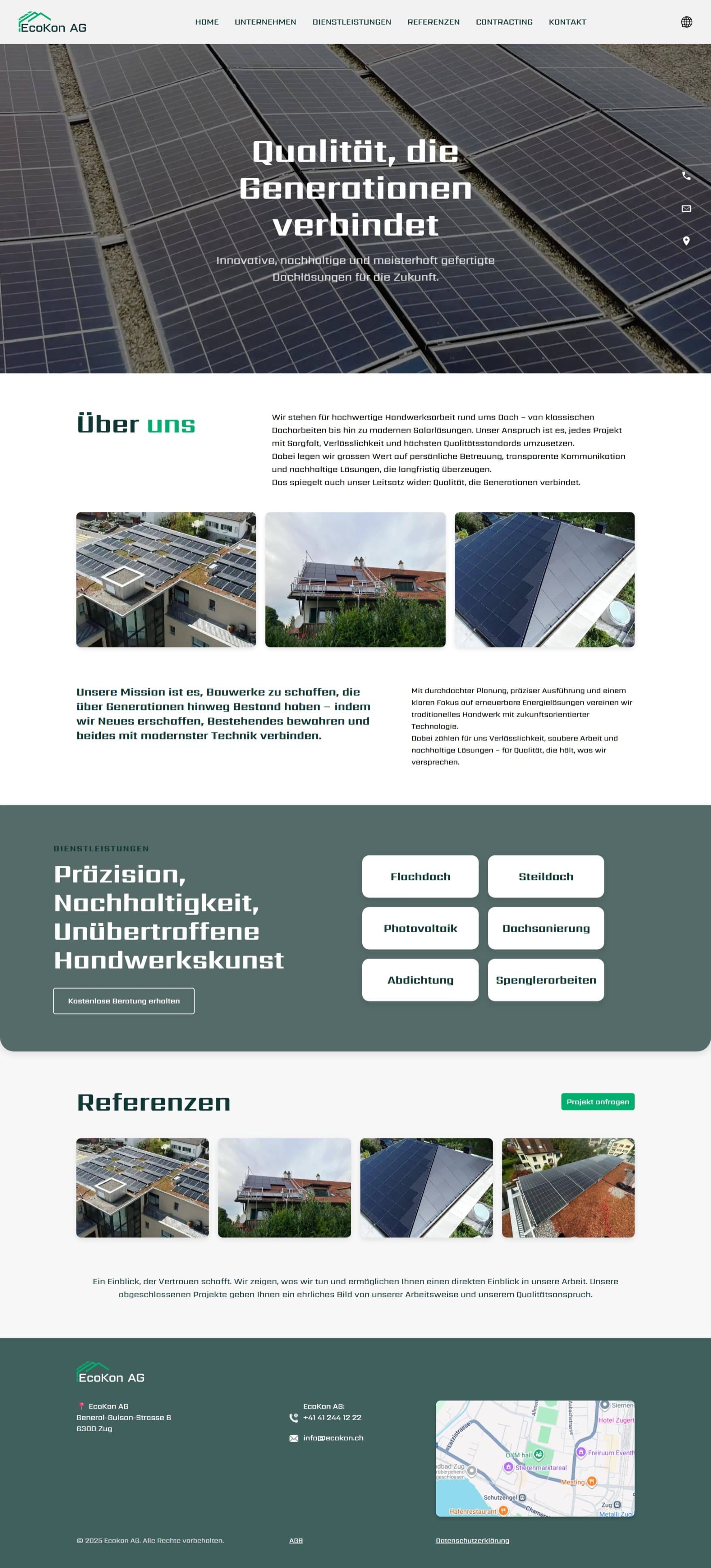
We designed a digital platform for EcoKon that showcases their expertise in heat pumps, solar panels, and contracting solutions — making complex technology clear and accessible.
Your brand shouldn't just inform — it should inspire trust and drive change.
EcoKon drives the energy transition in Switzerland — combining sustainable heating, solar power, and innovative contracting models.
CHALLENGE
BUILDING A FUTURE-PROOF ENERGY MODEL
Switzerland's shift towards renewable energy requires flexible solutions that balance efficiency, affordability, and sustainability. Many property owners and companies struggle with high upfront costs and fragmented systems. EcoKon needed a clear way to showcase its expertise in heat pumps, solar panels, and modern heating solutions — while also making its contracting model easy to understand.
SOLUTION
FROM COMPLEXITY TO CLARITY
Together with EcoKon, we built a platform that explains energy innovation in simple terms. The new website presents their key services — from geothermal and air-source heat pumps to PV installations and energy contracting — in a structured and engaging way. Clear navigation, bold visuals, and accessible storytelling ensure that EcoKon's value is easy to grasp for both homeowners and businesses.
We launched Alegria's new platform and saw instant impact: reservations grew, event bookings doubled, and the brand's digital reach expanded far beyond Zurich.
BEYOND THE WEBSITE
A FULL BRAND EXPERIENCE
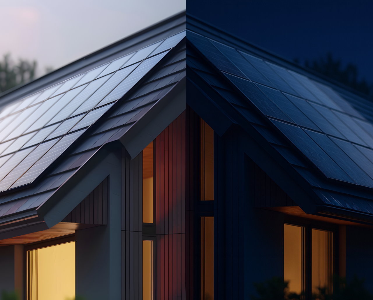
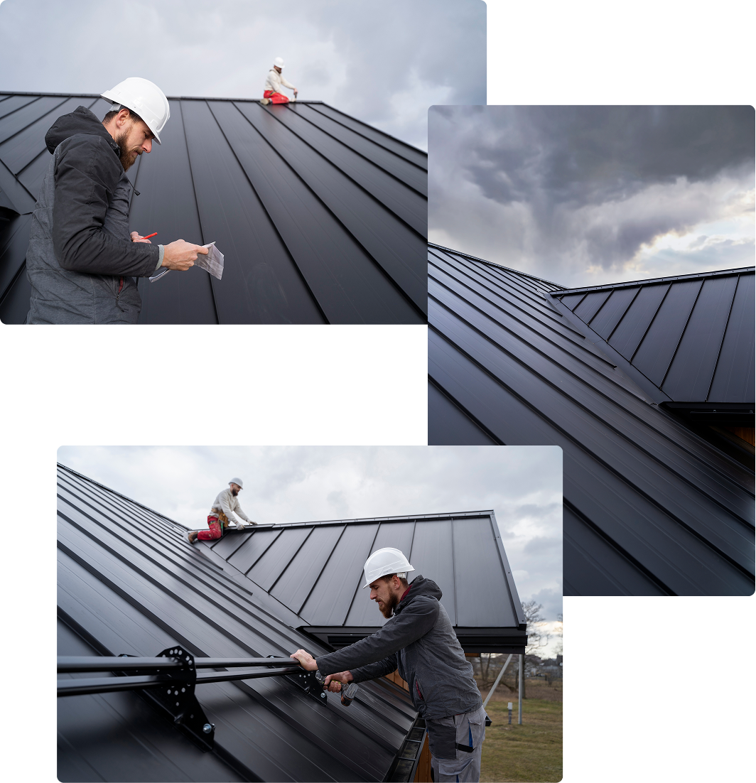
For EcoKon, we went beyond the website and built a brand that works like their energy systems—reliable, modular, and ready to scale. We defined the core identity (logo, colors, typography, grid, motion) and turned it into a practical brand book with clear usage rules, accessible typography, and tone-of-voice guidelines. To make the brand live in the real world, we produced drone video and photography of actual installations, then extended the identity across brochures, data sheets, proposals, and event materials. The same system powers sales and investor decks, on-site signage concepts, and even vehicle and equipment branding, while web UI components and diagrams stay perfectly aligned. The result is a connected ecosystem where every EcoKon touchpoint—online and offline—speaks the same language. It shortens sales conversations, builds trust with technical and B2B audiences, and gives the team ready-to-use tools for consistent execution from first impression to signed contract.
To close the project, we launched EcoKon's new website together with updated brand materials — presenting energy, innovation, and sustainability in one unified digital identity.
RESULTS
VISIBILITY + TRUST
With the new platform, EcoKon strengthened its reputation as a reliable partner in Switzerland's energy transition. The site increased traffic from potential clients, simplified project inquiries, and positioned EcoKon as a thought leader in sustainable energy.
"This project shows how design can turn technical complexity into trust and clarity." EcoKon Team
+40%
Increase in website traffic within the first months
2×
Growth in service inquiries for heat pumps and PV solutions
+25%
Improved client engagement through clear contracting information
Next case
where food and culture merge into one experience
We designed a digital platform for Allegria that brings together dining, live concerts, and a photo gallery in one seamless interface.
Your brand shouldn’t just be seen — it should be alive on screen.
Alegria brings the vibrant spirit of Peru to Zurich — blending authentic flavors with a culture of joy.
CHALLENGE
A FAMILY LEGACY TURNED INTO A MODERN EXPERIENCE
Alegria was born from Mercedes’s passion for Peruvian flavors and the remarkable longevity of her 102-year-old mother. What started as family recipes became a culinary vision rooted in superfoods, organic ingredients, and mindful eating. By bringing these traditions to Zurich, Alegria redefined how authentic cuisine and well-being could merge under one roof.
SOLUTION
TURNING A RESTAURANT INTO A DIGITAL EXPERIENCE
Together with Alegria, we built more than just a website — we created a platform that carries the restaurant’s soul into the digital space. From online reservations to showcasing concerts and photo galleries, every touchpoint was designed to feel as authentic as the dining experience itself. Clear navigation, bold visuals, and a storytelling approach helped Alegria’s brand speak the same language online as it does at the table.
We launched Alegria's new platform and saw instant impact: reservations grew, event bookings doubled, and the brand's digital reach expanded far beyond Zurich.
BEYOND THE WEBSITE
A FULL BRAND EXPERIENCE
We didn’t stop at the website. Together with Alegria, we built a complete brand ecosystem. From photo and video production to documentation, menus, flyers, and even advertising campaigns on trains — every asset was crafted to reflect the same visual identity. This holistic approach ensured that whether guests discovered Alegria online, saw a flyer, or held a menu in their hands, they experienced one unified brand voice. Consistency across digital and print touchpoints not only strengthened Alegria’s presence but also amplified recognition and trust.
And to close the project, we launched Alegria’s new website together with their anniversary event — celebrating food, music, and culture in one place.
RESULTS
Stronger brand, stronger business
Alegria’s new platform and visual identity boosted the restaurant’s visibility and created a consistent brand experience across both digital and print. Online reservations increased significantly, event attendance doubled, and customer engagement rose through seamless navigation and storytelling design.
" This project proved that even a small team can achieve big results when creativity meets precision. Together with Pusaq, we built not just a website, but a complete brand ecosystem that supports Alegria’s growth " Alegria Team
+45%
Online reservations in the first 3 months
2×
Growth in event attendance
+30%
Increase in social media engagement
Next case
WHERE SECURITY AND DESIGN MEET TRUST AND CLARITY
We created a digital platform for Inter Protect that communicates their expertise in insurance solutions with precision and confidence. The new website combines a modern aesthetic with a clear information structure — making complex insurance topics simple, approachable, and transparent for every client.
Your brand shouldn’t just protect — it should connect, educate, and inspire trust at every step.
Inter Protect builds trust through clarity — offering tailored insurance, pension, and financial solutions with a human touch.
CHALLENGE
REDEFINING TRUST IN A COMPLEX INDUSTRY
The insurance and pension landscape in Switzerland is often seen as opaque and overly complicated. Clients face endless paperwork, unclear terms, and little transparency. Inter Protect needed a digital platform that simplifies these complexities — showing that insurance can be not only reliable but also human, modern, and easy to understand.

SOLUTION
FROM CONFUSION TO CONFIDENCE
Together with Inter Protect, we created a digital experience that makes complex financial topics simple, transparent, and approachable. The new platform presents insurance, pension, and investment solutions through clear structure, intuitive navigation, and human-centered design. Friendly visuals, clean language, and a consistent tone build trust — helping clients feel informed, empowered, and confident in their choices.
We launched Inter Protect’s new platform and saw measurable impact: client inquiries increased, session times grew, and the brand strengthened its reputation for clarity and trust across Switzerland.
BEYOND THE WEBSITE
A COHERENT BRAND SYSTEM BUILT ON TRUST
For Inter Protect, we went far beyond the website — shaping a complete brand experience that reflects transparency, expertise, and care. We started by redefining the core identity: a clean logo, balanced typography, and a confident color palette that convey reliability and simplicity. These elements came together in a structured brand book with tone-of-voice, iconography, and motion guidelines — ensuring the same clarity across every channel. To bring the brand to life, we produced a full suite of photography and video content that captures real people, real advice, and real trust in action. The visual system extends across print materials, presentations, client documents, and campaign assets — creating one consistent language that unites all communications. The result is a brand that feels human and dependable — one that explains complex topics clearly, supports client confidence, and strengthens Inter Protect’s position as a trusted partner for the long term.
To close the project, we launched Inter Protect’s new website along with refreshed brand materials — bringing clarity, trust, and professionalism together in one cohesive digital presence.
RESULTS
CLARITY + CONFIDENCE
With the new platform, Inter Protect elevated its image as a transparent and dependable partner in the insurance and pension industry. The website improved engagement, increased client inquiries, and helped simplify the way people explore and compare financial solutions.
" This collaboration proved that good design isn’t just about aesthetics — it’s about making people feel informed, secure, and confident " Inter Protect Team
+35%
Increase in website visits within the first quarter
1.8×
Growth in consultation and policy requests
+20%
Higher engagement through clearer navigation
Next case